I'm very happy with the current state of the game. It's still not finished and released like I was hoping for but it's certainly finished enough to take to exhibitions and I'll be taking it to 3 in the next few months. I've learned a lot about how to finish a game and the first few weeks felt like a big learning curve in terms of motivating myself to work on the boring stuff like menus, save systems and UX. Once I made some headway though I started to enjoy doing all the boring stuff too as the game was starting to feel more and more like a finished product. I prefer to work on the systems so I put off working on the character design, which I new needed changing early on in the project. However it payed off as when I started to think about the character in terms of solving a problem, which in this case was displaying the UI, I created a really great design that helped to streamline the rest of development from then on. I would argue though that if I had come up with that character earlier in development, I wouldn't have had to go back and redesign lots of game elements, which would have saved me time.
I feel my programming skill has improved a lot but working solo on every element of the game has improved my understanding of managing a project even more. In the past I would have developed the first solution that came to mind when thinking about something like tracking the number of rounds won, but this project has taught me to take a step back a bit and brain storm ideas in Photoshop first. Some of the best work in the project has been created in this way; I think I've found a new design pipeline. Using Olly Moss's style as a reference has been hugely beneficial to the art direction as it's allowed me to relatively quickly create concepts for areas and immediately implement them in the game as backgrounds.
I've slacked a bit in terms of posting content about my game on social media other than the occasional #screenshotsaturday but I've made up for it with all the connections and feedback I got at EGX and NIGD meetups. I'm confident the new characters, logo and icon I created have improved the cohesion and marketability of the game and I'm looking forward to figuring out more about the world these characters live in. I'd like to do some kind of environmental story telling with the locations and collectable items at some point before release. I'm also very happy with how the business cards have turned out and I'm looking forward to distributing them and the stickers at NGF in a couple of weeks.
I've done my best to create a game that can cater to both new and seasoned gamers in terms of making the game forgiving and immediately fun enough to pickup and play whilst also having the depth and skill ceiling of a competitive game. Also in the sense of art direction; I've made characters that are customizable and likeable at first glance but a world that has the depth and atmosphere that should keep players wanting to learn more. I've even applied this methodology to the marketing of the game with the various clips I've uploaded, business cards and stickers as well as designing a competitive game that people might want to stream/ share footage of online and the [::] motif I've tried to repeat throughout the game and promotional material.
Thursday 18 May 2017
YEAR 3 - BA3b - New Menu Polish & Steam Mockup


I actually tried out the decorating style the artist at INOPS told me about at EGX Rezzed where I paint over the top of an image of the game and the paste it back on top of the geometry afterwards.
The image on the left shows the old style and the image on the right shows the paint-over style. I think it looks quite goofy, almost like a crayon drawing. There's something likable about it but I'm not sure it looks as good as the version I've been using up to now. It's possible I'll use it as an unlockable art style at some point though. I'd like to try a paint over again at some point though because I think I could make it look less goofy.
Tuesday 16 May 2017
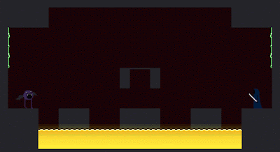
YEAR 3 - BA3b - Arcade mode & New Bullets
I worry about the marketability of the game given that it only works with 2 players at the moment. I concluded that if I want people to buy the game and not ask for a refund and/or berate me on twitter I should focus on making more content for the individual player. I don't know whether or not I want to go as far as making a full metroidvania again but I might make some more levels in the same style as the tutorial.
 Arcade mode is a re-imagining of the very first version of the game, even using the same shooter asset. One of the coolest things about Alien::Qualifier is the ability to navigate around bullets in mid air so for arcade mode I slowed down the speed of the enemies bullets to 1/3 of the normal speed to put the player in the situation you see above where they're jumping around, tracking and calculating their jumps so as to avoid the enemies bullets. It feels really good to pull off.
The bullet knockback affects this game mode interestingly. The player has to be vary careful about shooting in the air when there are lots of bullets because the knockback can make movement difficult to predict but the knockback can also be used by advanced players to move backwards whilst facing in the same direction or to quickly push themselves out the path of a bullet.
This version of the arcade has reflecting turned off because it would make the game much too easy.
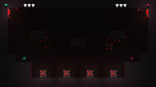
I like the design of the encounter because it gives the player the choice of where they want to shoot the enemy but only to a degree as they have to hit all 4 targets before any respawn. This forces the player to make use of all their abilities as they try to reach the highest point to shoot the top target, which is always difficult.
At some point during development I changed the hover bar to recharge slowly on the ground rather than instantly resetting but I forgot to write a post about it (I also made the jumps recharge slowly but removed it again because it was frustrating and difficult to track).
The slow hover bar recharge is really interesting in this game mode because the player is encouraged to spend so much time in the air, managing hover bar charge becomes really important and sometimes the player has to spend time making skillful dodges on the ground in order to recharge the hover as much as possible.
This game is actually one of my favorite things to do in the game and I'd like to add more game modes like this.
 Also I changed the bullet design to shapes rather than colors due to the colors being difficult to tell
apart, especially for colorblind people. The new top tier bullet looks really big and threatening; It's clear it cannot be reflected. That said, another mechanic I added was the power reflect, where a frame perfect reflect can actually reflect a top tier bullet and at a higher speed. It's something I borrowed from Super Smash Bros Melee It's ridiculously hard to pull off though and is only intended to create lucky instances for players and as a very high skill more for advanced player.
I really love how it looks like the bullet knocks out the characters teeth when it hits (Also, the red eyes are invincibility frames (i frames) )
Arcade mode is a re-imagining of the very first version of the game, even using the same shooter asset. One of the coolest things about Alien::Qualifier is the ability to navigate around bullets in mid air so for arcade mode I slowed down the speed of the enemies bullets to 1/3 of the normal speed to put the player in the situation you see above where they're jumping around, tracking and calculating their jumps so as to avoid the enemies bullets. It feels really good to pull off.The bullet knockback affects this game mode interestingly. The player has to be vary careful about shooting in the air when there are lots of bullets because the knockback can make movement difficult to predict but the knockback can also be used by advanced players to move backwards whilst facing in the same direction or to quickly push themselves out the path of a bullet.
This version of the arcade has reflecting turned off because it would make the game much too easy.
I like the design of the encounter because it gives the player the choice of where they want to shoot the enemy but only to a degree as they have to hit all 4 targets before any respawn. This forces the player to make use of all their abilities as they try to reach the highest point to shoot the top target, which is always difficult.
At some point during development I changed the hover bar to recharge slowly on the ground rather than instantly resetting but I forgot to write a post about it (I also made the jumps recharge slowly but removed it again because it was frustrating and difficult to track).
The slow hover bar recharge is really interesting in this game mode because the player is encouraged to spend so much time in the air, managing hover bar charge becomes really important and sometimes the player has to spend time making skillful dodges on the ground in order to recharge the hover as much as possible.
This game is actually one of my favorite things to do in the game and I'd like to add more game modes like this.
 Also I changed the bullet design to shapes rather than colors due to the colors being difficult to tell
 apart, especially for colorblind people. The new top tier bullet looks really big and threatening; It's clear it cannot be reflected. That said, another mechanic I added was the power reflect, where a frame perfect reflect can actually reflect a top tier bullet and at a higher speed. It's something I borrowed from Super Smash Bros Melee It's ridiculously hard to pull off though and is only intended to create lucky instances for players and as a very high skill more for advanced player.
I really love how it looks like the bullet knocks out the characters teeth when it hits (Also, the red eyes are invincibility frames (i frames) )
Sunday 14 May 2017
YEAR 3 - BA3b - I'm now the director of a company && another round counter
At EGX Rezzed a while ago I spoke to Rami Ismail and he told me to talk to the people at ID@XBOX. They told me that as an indie developer I can apply to get on the XBOX and Windows Marketplace if I set up as a company.
Today I did just that. The conformation has come through that DENDRITE GAMES LTD is an official company that I am now in charge of. This means I can publish my games on the Xbox store and Steam now.
I've updated the round counter again now I've had feedback.
 I figured the game needed an intermediate room between rounds to rest where I count up the score for them to clearly see. Above you can see a variety of designs I made.
The 1st one is similar to DuckGame where the two characters are moving horizontally to get to a location. I like the feeling of progression in this one.
The 2nd design is more thematic. I like the idea of the characters being in purgatory and fighting for a chance to go to heaven or hell so the weighing scales was in reference to that. It seems too abstract though and difficult to actually track.
The 3rd was going to be an animated clip of the characters removing health from one another but it seemed too confusing since that's what you do in the game anyway.
In the 4th design I went back to the faces again before running into the same mistake of only 4 rounds.
That's when I came up with the 5th and 6th designs that would just be like elongated faces.
Finally, in the 7th design I settled on a new cheerleader character that would cheer you on between rounds. Similarly to the main character, the face would represent the score but this time it's only horizontal so hopefully it won't confuse players.
 This is what it looks like in game. I love the characterization. The width of the head is PROCEEDURALLY GENERATED based on the number of rounds the player has chosen. The character is actually made up of 5 different parts, lots of time and maths to get this working but I did it and I really love the result!
I also have separately themed celebration rooms based on what world the players were fighting in.
Today I did just that. The conformation has come through that DENDRITE GAMES LTD is an official company that I am now in charge of. This means I can publish my games on the Xbox store and Steam now.
I've updated the round counter again now I've had feedback.

The 1st one is similar to DuckGame where the two characters are moving horizontally to get to a location. I like the feeling of progression in this one.
The 2nd design is more thematic. I like the idea of the characters being in purgatory and fighting for a chance to go to heaven or hell so the weighing scales was in reference to that. It seems too abstract though and difficult to actually track.
The 3rd was going to be an animated clip of the characters removing health from one another but it seemed too confusing since that's what you do in the game anyway.
In the 4th design I went back to the faces again before running into the same mistake of only 4 rounds.
That's when I came up with the 5th and 6th designs that would just be like elongated faces.
Finally, in the 7th design I settled on a new cheerleader character that would cheer you on between rounds. Similarly to the main character, the face would represent the score but this time it's only horizontal so hopefully it won't confuse players.
I also have separately themed celebration rooms based on what world the players were fighting in.
Saturday 13 May 2017
YEAR 3 - BA3b - Area variation
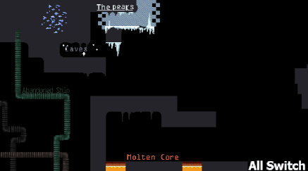
I tried to make all the areas in the game distinct both visually and mechanically. The only complete ones at this point in development are The Caves and Molten Core
 The caves are designed to be the introductory area so I've kept the level designs as simple as possible without too many new environmental things to learn.
The caves has lots of blue and purple hues because I wanted them to feel cold and remote. They're dark but crystals and fireflies help to light up the space to make the caves an atmospheric first location.
 The molten core is deeper into the planet and has larger spaces than the caves. Fireballs will be shooting out the lava vertically whilst the more open plan allows your opponents to rein fire on you from further away horizontally. The molten core is primarily red and orange because I wanted it to feel hot in contrast to the cold caves. The core is dangerous as even the ground itself is moving.

The peaks are lonely and at one of the highest points of the planet. A drop from this height will surely kill you so you better be careful where you step because the ground is covered in ice up here. The peaks has a lot of endless pits and open design so I consider it an advanced area. The peaks is mostly white, blue, and black as it's mostly frozen over.

 The belly (organic) is still very much in development. I'm undecided exactly on which direction I want to take it but I intend to have much more rounded shapes, blood splatters and a moving environment. I'd like The Belly to be much more destructible than the other areas with plants growing inside it that release spores upon being shot. The spores affect the environment in a variety of ways, such as slowing down bullets that pass through and infecting walls with bouncy gel.
The environment will include lots of reds, pinks and black. Lot's of squishy sounds as the players walk along the ground and hidden traps in The Belly.
 The infested ship will be mostly grey and green with patched of white parasites. It will include bits of machinery such as conveyor belts, and buttons that can open/close doors or switch the direction of conveyor belts. The infested ship is intended to be slightly less hostile than The Belly but just as interactive; an intermediate area with little or no endless pits.

The caves has lots of blue and purple hues because I wanted them to feel cold and remote. They're dark but crystals and fireflies help to light up the space to make the caves an atmospheric first location.
 The molten core is deeper into the planet and has larger spaces than the caves. Fireballs will be shooting out the lava vertically whilst the more open plan allows your opponents to rein fire on you from further away horizontally. The molten core is primarily red and orange because I wanted it to feel hot in contrast to the cold caves. The core is dangerous as even the ground itself is moving.
The peaks are lonely and at one of the highest points of the planet. A drop from this height will surely kill you so you better be careful where you step because the ground is covered in ice up here. The peaks has a lot of endless pits and open design so I consider it an advanced area. The peaks is mostly white, blue, and black as it's mostly frozen over.

 The belly (organic) is still very much in development. I'm undecided exactly on which direction I want to take it but I intend to have much more rounded shapes, blood splatters and a moving environment. I'd like The Belly to be much more destructible than the other areas with plants growing inside it that release spores upon being shot. The spores affect the environment in a variety of ways, such as slowing down bullets that pass through and infecting walls with bouncy gel.
The environment will include lots of reds, pinks and black. Lot's of squishy sounds as the players walk along the ground and hidden traps in The Belly.

Thursday 11 May 2017
YEAR 3 - BA3b - Count Down, New Reflector && Norwich Indie Game Dev Feedback 2
 One of the things mentioned last time I took my game to a NGD meetup was that you could spawn in run into a hole immediately because there's no warning. So in time for the next meetup I made a countdown timer before each round. Again, it uses the [::] motif because I'm trying to make it a consistent thing throughout the game now.
Another thing I changed recently is the reflector now looks more like it belongs to the new character. It works as a short range projectile that takes in to account the players movement, so a fast moving player can move full speed towards a bullet and reflect just in time to shoot their reflector further. The reason they might want to do this is because the reflector can now be used to displace opponents. I love this because it half solves the problem I was having with the highest ground being the most beneficial. This new displacement mechanic now gives the attacking player a much better chance at pressuring the defensive player.
NIGD FEEDBACK:
The game has gone through a huge change since I last showed it off at a NIGD meetup so I brought it again to test out the new tutorial and to see what people think of the new changes made to PvP~
PROBLEM- The countdown timer (the little TV looking things in the top corners) aren't acknowledged.
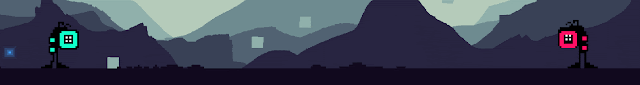
NOTES - I added these recently but forgot to make a post about them (like lots of things I've added). They track the number of rounds a player has won and count up one by one until they reach 4 and a player is declared victorious. One of the main problems is that they just don't stand out at all. Another is that they look like they can be interacted with but can't. The 3rd major problem with their design is that the count UP, whereas everything else with the [::] design counts down. This may confuse the player.
SOLUTION - What I need to do is, firstly, make them count horizontally rather than like [::] and secondly, I need to make an intermediate room where I focus on the round number actually increasing.
PROBLEM - 5 rounds to win is too much.
SOLUTION - If I make the new horizontal counter variable I can give the player the option to change how many rounds are required for a win.
PROBLEM - In the 2nd tutorial level people can cheat what I'm trying to teach them by dropping down further and exploiting mid-air jumps. Because of this, players get stuck on the final section of tutorial2 because they didn't properly learn the moves I was trying to teach them.
SOLUTION - I need to redesign it to have lava directly below so people can't cheat the tutorial.
PROBLEM - The font in the tutorial is difficult to read, but the button images places around make up for it.
SOLUTION - Find a new font that works well in a low resolution
GENERAL NOTES
- People really really like the new diegetic UI on the characters. Most people found it fairly self explanatory and easy to read. They also like the new character design.
- People like the new countdown timer. "It's really clear what it is despite it looking alien"
- Everyone who tried the tutorial managed to get through it without too much issue or help from me.
- Buddy could do with more characterization in what he says
- There's a bug where the first character slowly slides left and won't turn round but fixes itself after a little while [EDIT, fixed now]
Monday 8 May 2017
YEAR 3 - BA3b - Business Cards and Stickers!

This is the front of the final design. It has 3 potential backs.
I followed Sharron and Jess Hiders (UKIE) advise as closely as I could whilst designing it.


I included the logo on this side of the card instead of the front.
The first one is exactly the same image as I use for my NGF submission.
The molten core one is a slightly edited version of the concept art but I added the logo in the middle and redrew the fireball so it didn't overlap the logo. I did some fun stuff with the blobs of lava falling in front of and behind the logo.
For the Ice one I used the white version of the logo on top of a newly painted concept piece. I used a clipping mask and a light blue gradient to give the logo an iced look.
I'm hoping that together these 3 designs will make players excited for the game and advertise me as an artist/developer.

The icon I've been currently using for the game seemed like a good design to use and with the player color customization now in the game I thought it'd be nice to give people a choice of colors.
Friday 5 May 2017
YEAR 3 - BA3b - Tutorial Helper design

I knew I just wanted them to be a small alien looking creature that has a resemblance to the main character.
In the early concepts I tried out just one eye and played with the idea of Buddy having a hover bar too.
You can see from number 4 onward I tried keeping the 4 eye motif before coming up with the skull shape.

In number 8 I tried different sized eyes and that made the 2 upper ones look like eyebrows and Buddy was pulling an impatient face. I really liked the personality this game the character so in number 9 I reduced the eyes down to 2 and made them more expressive. I also added ears, that I could animate a future date to show expression too.
This gif shows the character in game. I animated it's movement similarly to the sin wave squares in the background and made it follow the players position. I also made the ears separately so that they drift behind the character, giving it more life. Buddy's idle animation is just blinking but he looks left and right when the player has stood still for too long; all in the hopes of giving Buddy a bit more life as a character.
 I recently reworked the character select room in the game too to allow the players to customize their alien. The players can push left and right to change the hue and up and down to change the saturation.
Hopefully this should allow players to associate more closely with their character and I'd still like to add a cosmetic item unlock system eventually.
Thursday 4 May 2017
YEAR 3 - BA3b - Tutorial
After removing single player mode from the game completely, I've decided to bring it back again to try and teach players how to play.
 This first stage is designed to teach the player the basics of movement; jumping, and hovering.
The little black creatures aren't enemies, they're waypoints for the helper which I'll talk about later in this post.
In the left half of the screen you can see I introduce the jump, and air jump. In the second half, the gaps are larger; here I'm trying to encourage the player to hold down the jump key to hover without explicitly telling them. But if they don't get it immediately, the helper will tell them what to do.
I've also included little pictures on the walls (that change based on whether or not a gamepad is connected) telling the player what buttons they need in each situation so even if they don't read the helpers advise, they should at least have an idea of what they need to do.

The second stage is all about teaching the player aerial movement; hovering mid fall, and double jumping out of a hover.
I'm keeping the stages short so as to reduce the punishment time for dying. The first hole just requires hovering mid fall, the second requires hovering strait off a platform and jumping mid-air, and the third requires falling, hovering, moving and jumping all in the same move, which should hopefully teach the player about making the most of their air jumps too.
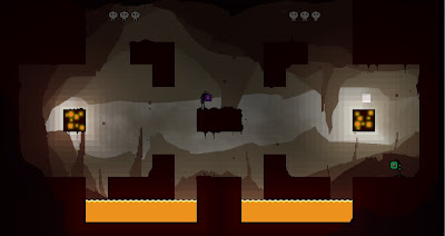
 This third stage is to teach the player how shooting and reflecting works. I reused some enemies from the metroidvania version of the game to make it.
The first challenge just requires that the player press the attack button whilst in a safe space. I use the breakable ground to show that the player can damage things. The first enemy just requires an attack, the second teaches the player that they can shoot in mid-air. The tall enemy shoots at the player and I'm trying to get the player to try and shoot it, accidentally reflect it's bullet and in the process, learn that they can reflect bullets. If they don't get this immediately though, the helper is there to tell them. Finally, the glass block is there to show to players that they can reflect any bullet including their own and that certain ground types require higher tiers of bullet to break.
-- Another major change I made to the game is to reduce the number of bullet tiers from 3 to 2 --
I've concluded that 3 is too complicated to track for most people and tier 1 and 2 operate more or less the same way in 90% of cases, so I removed the middle tier. Also, 3 tiers gives the more defensive player a bigger advantage in that they can shoot whilst being safe from reflected bullets (because they'll get the option to reflect it back again). 2 tiers however means they have to be a lot more careful about when they shoot, which I think will improve the flow of the gameplay.
--- EDIT - 18/05/2017 ---
Adding a video of the most recent version of the tutorial to show how Buddy moves and tells the player what to do.

The little black creatures aren't enemies, they're waypoints for the helper which I'll talk about later in this post.
In the left half of the screen you can see I introduce the jump, and air jump. In the second half, the gaps are larger; here I'm trying to encourage the player to hold down the jump key to hover without explicitly telling them. But if they don't get it immediately, the helper will tell them what to do.
I've also included little pictures on the walls (that change based on whether or not a gamepad is connected) telling the player what buttons they need in each situation so even if they don't read the helpers advise, they should at least have an idea of what they need to do.

The second stage is all about teaching the player aerial movement; hovering mid fall, and double jumping out of a hover.
I'm keeping the stages short so as to reduce the punishment time for dying. The first hole just requires hovering mid fall, the second requires hovering strait off a platform and jumping mid-air, and the third requires falling, hovering, moving and jumping all in the same move, which should hopefully teach the player about making the most of their air jumps too.

The first challenge just requires that the player press the attack button whilst in a safe space. I use the breakable ground to show that the player can damage things. The first enemy just requires an attack, the second teaches the player that they can shoot in mid-air. The tall enemy shoots at the player and I'm trying to get the player to try and shoot it, accidentally reflect it's bullet and in the process, learn that they can reflect bullets. If they don't get this immediately though, the helper is there to tell them. Finally, the glass block is there to show to players that they can reflect any bullet including their own and that certain ground types require higher tiers of bullet to break.
-- Another major change I made to the game is to reduce the number of bullet tiers from 3 to 2 --
I've concluded that 3 is too complicated to track for most people and tier 1 and 2 operate more or less the same way in 90% of cases, so I removed the middle tier. Also, 3 tiers gives the more defensive player a bigger advantage in that they can shoot whilst being safe from reflected bullets (because they'll get the option to reflect it back again). 2 tiers however means they have to be a lot more careful about when they shoot, which I think will improve the flow of the gameplay.
--- EDIT - 18/05/2017 ---
Adding a video of the most recent version of the tutorial to show how Buddy moves and tells the player what to do.
Sunday 30 April 2017
YEAR 3 - BA3b - Level Design and music

I try to stick to a specific set of rules when designing maps:
1. Generally I don't like giving players blocks in front of them when they're standing on ground (map 3 is an exception) because it gives them a safe place to hide and wait for the opponent to approach. Map 1 has ground that allows bullets to pass through it in the middle. This allows me to create an island at ground height without giving players too much cover.
2. The only situation where I do allow cover like this is when there is an easy way to get the drop on the defensive person such as in map 3. Due to the landing on heads mechanic, and the limited air jumps, the most powerful areas are the highest points.
3. I try to always give at least 2 points at the highest altitude so that both players have the option to pressure one another. map 2 is an exception because the highest point has ground directly above it, so a single reflected bullet coming towards them forces them off the platform, which is now available to the attacking player.
I particularly like map 2's circular structure. In play tests I've noticed players move around a lot on this map, constantly trying to exploit the high ground on top of the floating island whilst using the island itself as an areal shield. I also think visually it's one of the more appealing maps to look at and understand.
I like the endless pits in map 1 too because it always feels really skillful to drop into a hole, hover, and jump out again to avoid a bullet. It definitely requires more technical skill though and can lead to lots of accidental self-destructs so I'm generally going to avoid putting endless pits in the caves given that they're intended to be the easiest maps.
I've been looking for music for a little while now, and the first person I messaged never got back to me but the second one did, and said I could use his tracks in the game. MrNightVarga on Newgrounds. I wanted something that was sci-fi but upbeat atmospheric. I didn't want to distract the player but I also wanted the music to bring a sense of place to the various areas in the game. MrNightVarga's tracks are the closest I've found so far.
Fragile Machine
Celestial Enchantment
Red Reflection
Bumpy Wheel
Monday 24 April 2017
YEAR 3 - BA3b - GameJuice and Visuals
To help make the game feel a bit more alive in time for Norwich Game Festival I've starting adding little juicy effects to the game. There are a million talks on this by Jan Willem Nijman, Meshoff, Sos Sosowsky etc... but the main things thay all say you can do to make your game feel nicer are:
- Screenshake
- Destructible Props
- Permanence

Lighting is turned off in this gif to make it easier to see the effects I've added.
I've added SCREENSHAKE whenever a character dies or a bullet explodes. I've also made tiny rocks fly out of walls and drop down from ceilings when a bullet hits a wall (DESTRUCTIBLE PROPS). Rocks also come out of the ground when a character lands. When a character dies they explode and goo flies onto the walls. To add a little more juice I also made it so the player kicks back when firing a bullet. Not only does this make the bullet feel really powerful, it also adds another element of skill into the game.
The rocks and goo stick for the entirety of the round (PERMANENCE).
The game feels a lot better with all of these things in. I've also included the ability to turn them off as they do reduce framerate and at a competitive level they could distract players from performing well.
I also think screenshake improves marketability of the game because it stands out from all the other gifs on twitter when it's shaking around and you can sort of 'hear' the explosion even with no sound.
- Screenshake
- Destructible Props
- Permanence
I've added SCREENSHAKE whenever a character dies or a bullet explodes. I've also made tiny rocks fly out of walls and drop down from ceilings when a bullet hits a wall (DESTRUCTIBLE PROPS). Rocks also come out of the ground when a character lands. When a character dies they explode and goo flies onto the walls. To add a little more juice I also made it so the player kicks back when firing a bullet. Not only does this make the bullet feel really powerful, it also adds another element of skill into the game.
The rocks and goo stick for the entirety of the round (PERMANENCE).
The game feels a lot better with all of these things in. I've also included the ability to turn them off as they do reduce framerate and at a competitive level they could distract players from performing well.
I also think screenshake improves marketability of the game because it stands out from all the other gifs on twitter when it's shaking around and you can sort of 'hear' the explosion even with no sound.
Thursday 20 April 2017
YEAR 3 - BA3b - Name, Logo, Icon, NGF

It stemmed from the creature face design looking like two colons, [::] and I figured it was quite iconic. There is a programming term for '::' called a Namespace Alias Qualifier and it's essentially used as a pointer to find information within a specific variable. Eg. [ob_character::health] would return the health of the character. The name 'Alien::Qualifier' is a pun on the programming term as the game is about aliens fighting (To find something within themselves?).
I also like the simplicity of the [::] design as it looks quite alien but it's simple and easy to replicate/ modify for other things. Qualities I heard about from graphic designer Michael Bierut. He speaks about it in 99% Invisible (Starts around 4:30).


The frame around the lettering incorporates the hover bar from the aliens face into the logo but it also looks similar to the shape of the ground in the game so I ran with it and added little bumps and spikes to emulate the environment art.


Thursday 13 April 2017
YEAR 3 - BA3b - NEW VISUALS, lighting system & background effects
GameMaker has no in built lighting system so I made my own from scratch (I've actually everything in this game from scratch except for the music).
The reason I'm making a lighting system is to try and dynamically emulate the gradients I managed to achieve in the concept art and, by extension, give the scene more depth and mood.
 This gif shows my first attempt at a lighting system. It's literally just a colored circle with a fading opacity that follows bullets.
The shading on pieces of ground was flat so in an attempt to give it lighting texture I placed pixels of ground color on top of the ground that draw above the lighting to break it up.
 For this system I used a nested for loop to create 8x8 pixel black squares that fill the room.
They change opacity based on their distance to the player, bullets and lights (no lights in the above scene). Because they incorporate bullets and players together as separate sources of light, the bullet creates a kind of mussel flash as it's spawned from the player due to lights in that location being close to both; a happy accident.
One potential issue with this lighting system how inefficient it is, code-wise. For example, this 640x360 pixel room / 8 means it has 3600 8x8 pixel light squares. All of which are calculating their opacity 60 times per second. That's 216,000 calculations per second!
However, the frame rate still stays well above 60FPS on my computer so for now I think I'll keep the lighting engine but give players an option to toggle it off/on (unless I make a better one).
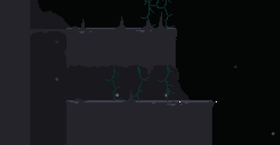
I recently watched THIS GDC VIDEO about the art of Owlboy and one of the things they mentioned (around 7 minutes) is that they started to add movement to objects in the background to give the scene more life.
So to give my levels more depth and interest I made little environmental props that I could procedurally animate.
The squares in the background move up and down and tilt using [sin(N)*(random(60)+20)] where N is increasing very slowly every tick. The amount of vertical movement and total tilt is also randomized but limited by this algorithm.
Also, the number of squares spawned and where they spawn is pseudo-random too, giving each play a slightly different feel, which should improve longevity of the game.
The ground blocks also have random change of spawning a drip if there are no ground blocks below them.
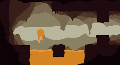 I've also been working on redesigning the Molten Core area.
The molten Core is generally much spikier and dangerous than the caves and the little details in the environment reflects this.
I use the same technique as in the caves concept art to make this piece, for both ease and consistency.
 I wanted the molten core to feel much more dangerous so, the tiny squares that move down the screen are blown by a heavy wind caused by lava heat and the huge spikes in the background move up and down to give the feeling of being inside a gigantic, otherworldly monster.
The reason I'm making a lighting system is to try and dynamically emulate the gradients I managed to achieve in the concept art and, by extension, give the scene more depth and mood.
 This gif shows my first attempt at a lighting system. It's literally just a colored circle with a fading opacity that follows bullets.
The shading on pieces of ground was flat so in an attempt to give it lighting texture I placed pixels of ground color on top of the ground that draw above the lighting to break it up.
I ended up scrapping this lighting engine because I came up with a better one

They change opacity based on their distance to the player, bullets and lights (no lights in the above scene). Because they incorporate bullets and players together as separate sources of light, the bullet creates a kind of mussel flash as it's spawned from the player due to lights in that location being close to both; a happy accident.
One potential issue with this lighting system how inefficient it is, code-wise. For example, this 640x360 pixel room / 8 means it has 3600 8x8 pixel light squares. All of which are calculating their opacity 60 times per second. That's 216,000 calculations per second!
However, the frame rate still stays well above 60FPS on my computer so for now I think I'll keep the lighting engine but give players an option to toggle it off/on (unless I make a better one).
I recently watched THIS GDC VIDEO about the art of Owlboy and one of the things they mentioned (around 7 minutes) is that they started to add movement to objects in the background to give the scene more life.
So to give my levels more depth and interest I made little environmental props that I could procedurally animate.
The squares in the background move up and down and tilt using [sin(N)*(random(60)+20)] where N is increasing very slowly every tick. The amount of vertical movement and total tilt is also randomized but limited by this algorithm.
Also, the number of squares spawned and where they spawn is pseudo-random too, giving each play a slightly different feel, which should improve longevity of the game.
The ground blocks also have random change of spawning a drip if there are no ground blocks below them.
 I've also been working on redesigning the Molten Core area.
The molten Core is generally much spikier and dangerous than the caves and the little details in the environment reflects this.
I use the same technique as in the caves concept art to make this piece, for both ease and consistency.

Saturday 8 April 2017
YEAR 3 - BA3b - Diegetic UI; New character

I liked the idea of incorporating the hearts in number 4 into some kind of clothing (jewels?). I also liked the round hover bar because of it's resemblance to a clock counting down, so it feels like it'll be self explanatory to the player.
 I ended up taking the concepts into pixel art because so I can more clearly see how the new UI might translate into the final 32x32 character and this is what I ended up with. This image shows a steady evolution of ideas where the most recent design is on the right. The ring around the face is the hover bar, and the eyes/teeth represent the health. The spikes on the back are the number of jumps the player has. I removed the arms because I didn't want the player to think they can use them to attack/grab/climb. In the right most design I thickened out the spikes because in game they were difficult to see.
 This image shows how the UI would change over time, with full jumps, hover and health on the right and none on the left.
This gif shows the character in game. I'm very happy with it, and in playing I've found it does its job at giving the player the required information.
It does look like it's standing in mid-air though wen still so I still need to update that.

This character looks a lot goofier and confident than the previous one (which looks a bit shy).
This new design is exactly the kind of iconic character I was looking for and it also solves the problem I was having with UI, so I'm very very happy with it.
Saturday 1 April 2017
YEAR 3 - BA3b - EGX Rezzed, UKIE Conference
I went to EGX Rezzed and The UKIE Student conference recently, saw some talks and spoke to some developers. In fact I spent almost the whole day at EGX just chatting to other developers and exchanging contact info.
One developer specifically that I spoke to; the Artist for upcoming mobile game, Inops, which has a similar silhouetted ground style to my game. I spoke to him about how he uses a screenshot of the level as a template to draw over in photoshop to create the details in the ground rather than what I've been doing which is to place tiny tiles of pixels on top of my geometry. It's a technique I'm going to seriously consider as the multiple tiles does slow the game down a bit.
I also spoke to Alex Johansson, who was working 'Vaccination', a co-op game where one player has to use a physical wooden syringe to poke drugs into an infected person whilst another person tells them where to poke. We talked about getting yourself known in the industry and starting out part time until you make enough money to go full time.
At UKIE, the three talks that stood out to me the most were:
- Jess Hiders talk about marketing. The main points I took away from it were to regularly post on twitter, which is something I try to do and intend to do more. Use hashtags related to the field #gamedev # indiedev (but not too many) and about what to include on business cards, Name, Twitter, Job Role, linkedin, email, website. I intend to make some sometime soon once the theme of my game is set.
- Fabien Vercuiel's talk about UI/UX design. The main takeaway was that you have to be both technical and creative as UI designers often do a lot of programming and effects too. I should get good at working in a range of styles and making icons. He also told me afterwards about what fonts might be good for my game. He also critiqued my UI and pretty much confirmed that I should switch to diegetic UI.
- Luke Williams' talk about game design. I like his design pipeline. He says to find the most fun thing about the game as soon as possible and to create the game around that core fun thing, which is a philosophy I've been trying to stick to since watching Tom Francis' videos a few years ago. Luke Williams also goes on to say however that difficulty is good because it insensitivises attempts at mastery but it's important that despite this, the game is still silly and enjoyable regardless of skill to draw in new players. This got me thinking about my current game and how I might need to rework some things to make it easier for new players to not kill themselves as my game is currently quite difficult already.
Friday 24 March 2017
YEAR 3 - BA3b - NIGD feedback
I took the game to the Norwich Independent Game Developers meetup and this was the feedback I got.
- Problem - Feedback (UI) difficult to focus on
- Solution - I'll redesign the ui so it 'sticks' to the character. This way the player doesn't have to pull their eyes away to see how many mid-air jumps they have left. I'll try to tie it in to the design of the character; which I read in THIS ARTICLE is called 'Diegetic UI'.
- Problem - The game needs more texture (like the concept art)
- Solution - The concept art has a subtle gradient that gives it more depth. Because of the resolution of the game it's difficult to replicate this in-game so I'm going to create depth through moving background elements and I'm going to try creating more of a gradient with some kind of home-brew lighting system.
- Problem - People sometimes run off an edge before realising the round has started.
- Solution - Make a countdown timer before the round starts. Design less 1 hit kill pits into the levels. Create a vertical screen wrap?
- Problem - Feels like the sword should be able to be used as a weapon but can't (currently just used to reflect bullets)
- Solution - For mechanical reasons I prefer the 'squashing' opponents 'melee' attack because it system where the high ground becomes beneficial and encourages movement around the stage which is makes the game more fun. Therefor I think it's better to redesign the characters into creatures without swords and come up with another contextual reason why the characters can reflect bullets.
BUGS:
- fix fullscreen page
- Jump on head is a bit buggy
OTHER FEEDBACK:
- Could be interesting if double jumps and hover time charge up on the ground rather than reset immediately (strategy around using jumps and exploiting players without)
- Change the shooting and reflecting sounds to something less jarring
- People generally prefer the right bumper as a shoot button
- People do generally enjoy playing and especially like jumping on peoples heads
- Animations will make the game feel more polished
- Retaining charged shots could be interesting
Monday 20 March 2017
YEAR 3 - BA3b - Environmental Concept Art

My game already has flat colors to represent the ground and after looking through some work by FireWatch artist 'Olly Moss' I figured I could apply a similar technique to my background too in the hopes that the game will look less flat as a result.
Here you can see a quick analysis of one of his pieces. Essentially, the further back a layer is, the lower the value and saturation of the colour. He also shifts the hue slightly between each layer.
 This concept piece is my attempt at applying the same technique to the caves location in my game and I'm really really happy with the result. It keeps the same feel of the original game but adds so much more depth to the scene.
Tuesday 14 March 2017
YEAR 3 - BA3b - Trying to find a theme/ creative direction - DUELETTE
I've been trying to figure out the theme of the game and how I'm going to overcome the issue of people trying to use the sword as a weapon. It got me thinking about how music notation essentially has set heights like the game does and whether or not that could work as the theme for the game. The players would move up and down and fire notes at different pitches to cooperatively create tunes, whilst also defeating enemies of some kind in different locations and music styles. The player could unlock new instrument types as they progress.
 I developed this version of the game in a couple of days and whilst, interesting I realized quite quickly that it was far too big of a jump to make from the previous design. I also learned that GameMaker: Studio doesn't handle overlaying SFX particularly well, so I'll have to keep that in mind whilst working on the regular version of the game. The experiment does allow the player to create tunes though and I quite like it because of that.
 I also developed a slightly different version where you play as treble clefs and you can reflect notes back as well as SHIFT into a sharp note. You use WASD and the ARROW KEYS to control the two characters.
I'll include DUELETTE in the hand in. Press 'P' twice on the main menu to see the 2 versions of the game.
I'd like to include some variation of this as a specific stage in the game maybe or as a boss in the single player version of the game because with all the extra stuff the regular game contains on top of this, it could be quite enjoyable.
I'm aware from testing that players think of the sword as a weapon that they can attack with, which isn't what it's for. I've developed another character that might explain how the character can hover, shoot and reflect and it's a cave/dragon creature that looks a bit like a bat.
 These are the original concepts. The skinny legs on number 2/4 I liked because they look easy to animate. I also like the two colors on 2/4.
 This image shows what unlock-able colors and cosmetic items might look like on the character. It seems to fit the theme and mood of the game and I like how the different colors feel like they're from different areas in the world and the cosmetic items could be things they;ve picked up on hteir travels. It helps to add a feeling of depth to the game world.
 This is what the character looks like in game. I had to simplify it a bit for the lower resolution. I like the flapping wings; I think they improve the feeling of floating but as a character I don't think this guy is particularly likable or iconic and I know how important that is for a marketable game so I'm going to keep trying things out.
 I also developed a slightly different version where you play as treble clefs and you can reflect notes back as well as SHIFT into a sharp note. You use WASD and the ARROW KEYS to control the two characters.
I'll include DUELETTE in the hand in. Press 'P' twice on the main menu to see the 2 versions of the game.
I'd like to include some variation of this as a specific stage in the game maybe or as a boss in the single player version of the game because with all the extra stuff the regular game contains on top of this, it could be quite enjoyable.
I'm aware from testing that players think of the sword as a weapon that they can attack with, which isn't what it's for. I've developed another character that might explain how the character can hover, shoot and reflect and it's a cave/dragon creature that looks a bit like a bat.


 This is what the character looks like in game. I had to simplify it a bit for the lower resolution. I like the flapping wings; I think they improve the feeling of floating but as a character I don't think this guy is particularly likable or iconic and I know how important that is for a marketable game so I'm going to keep trying things out.
Monday 6 March 2017
YEAR 3 - BA3b - Arrays; edits and settings
I've finally made a start on the settings screen for the game. It felt necessary for a polished game to have one if I'm going to sell the game to a variety of people.
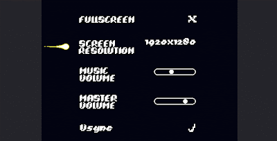 I also wanted a way to adjust the game volume so I could test out music playing in the background. This is so I can see what kind of music I'd like the game to have without having to change too much in-game.
I'm also testing out 3 different methods for automatically switching between rooms within worlds after a round because it's currently vague when somebody wins and it just restarts the current room.
I taught myself a new special type of array called a ds_list because it has more functions attached to it than normal arrays allowing me to check what number the current room is in the list for example.
Caves: Finds the current room in the array of cave levels, removes it from the array, shuffles the array, and picks the first room in the new list. Then refills the array once it's empty.
MoltenCore: saves the current room in a variable, chooses a new room randomly from the array and checks if it's the same one. If it is, it chooses another one.
Peaks: Just cycles through the rooms one by one
I like he caves method the best because it should theoretically lead to the player experiencing all the rooms before playing the same one again. In practice this does not work though because there's something wrong with how I've programmed it.
The Molten Core method seems to work consistently and with enough rounds the player experiences all the available rooms. I quite like how some rooms appear less frequently than others too because it makes them feel more special when you get them.
 I also wanted a way to adjust the game volume so I could test out music playing in the background. This is so I can see what kind of music I'd like the game to have without having to change too much in-game.
 I'm also testing out 3 different methods for automatically switching between rooms within worlds after a round because it's currently vague when somebody wins and it just restarts the current room.
I taught myself a new special type of array called a ds_list because it has more functions attached to it than normal arrays allowing me to check what number the current room is in the list for example.
Caves: Finds the current room in the array of cave levels, removes it from the array, shuffles the array, and picks the first room in the new list. Then refills the array once it's empty.
MoltenCore: saves the current room in a variable, chooses a new room randomly from the array and checks if it's the same one. If it is, it chooses another one.
Peaks: Just cycles through the rooms one by one
I like he caves method the best because it should theoretically lead to the player experiencing all the rooms before playing the same one again. In practice this does not work though because there's something wrong with how I've programmed it.
The Molten Core method seems to work consistently and with enough rounds the player experiences all the available rooms. I quite like how some rooms appear less frequently than others too because it makes them feel more special when you get them.
Subscribe to:
Posts (Atom)